Live Builder Interface
Avada Live Builder Interface Guide
Section titled “Avada Live Builder Interface Guide”This guide provides a detailed explanation of the Avada Live Builder interface components and how to navigate them effectively.
Interface Overview
Section titled “Interface Overview”When you open a page in the Avada Live Builder, you’ll see several key interface components:
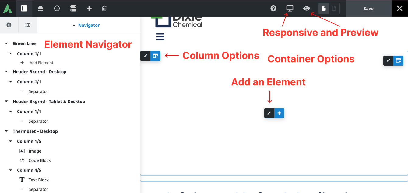
Avada Live Builder interface overview
Top Toolbar
Section titled “Top Toolbar”The top toolbar contains essential controls for managing your editing session:
| Control | Function |
|---|---|
| Avada Logo | Access to Avada menu options |
| Save Button | Save changes (draft, publish, or schedule) |
| Preview Button | Preview how changes will look on the live site |
| Responsive Mode | View page at different screen sizes (desktop, tablet, mobile) |
| Undo/Redo | Undo or redo recent changes |
| Exit Button | Exit the Live Builder and return to WordPress admin |
Left Sidebar
Section titled “Left Sidebar”The left sidebar contains several panels that can be toggled open or closed:
Elements Panel
Section titled “Elements Panel”- Contains all available content elements
- Organized by categories (Columns, Elements, Forms, etc.)
- Elements can be dragged and dropped onto the page
- Includes a search function to find specific elements
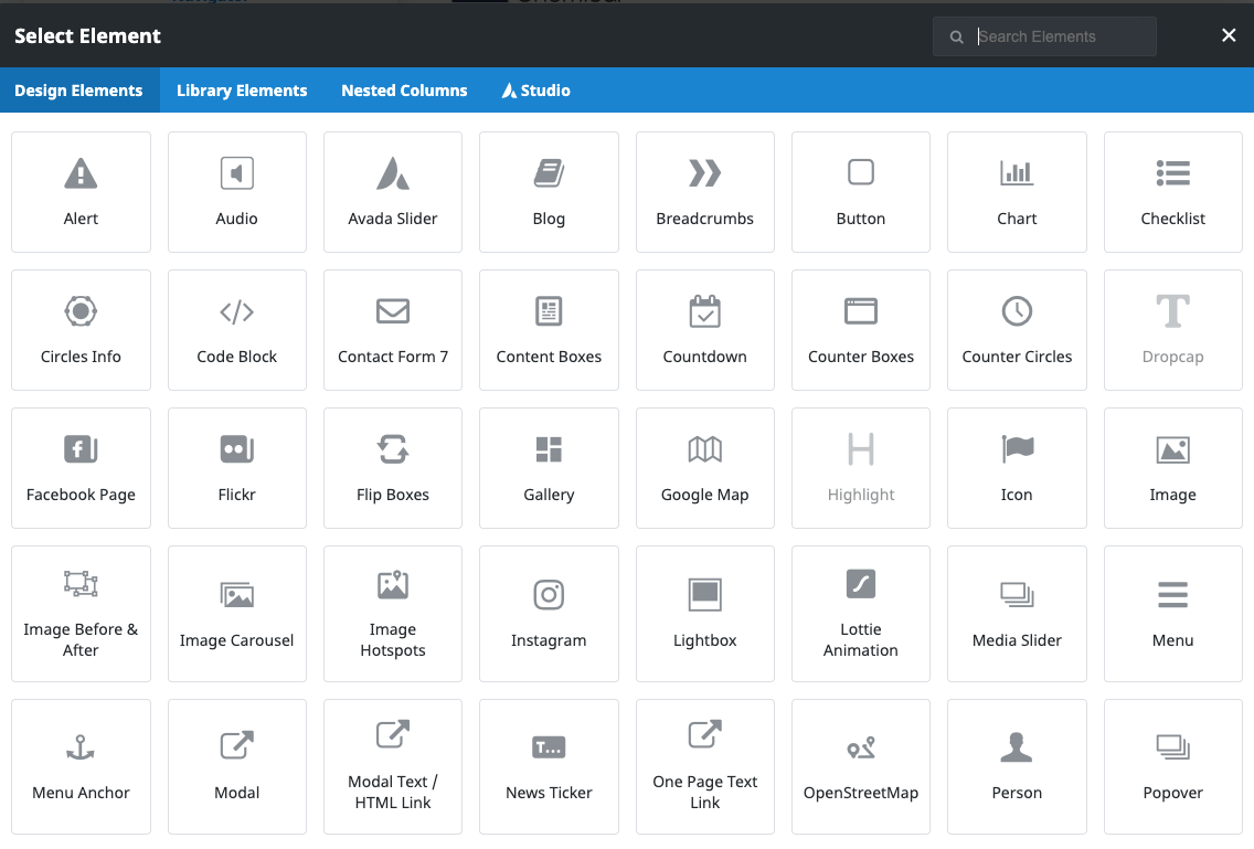
Elements panel showing available content elements
Navigator Panel
Section titled “Navigator Panel”- Shows a hierarchical tree view of all page elements
- Helps select nested or hard-to-click elements
- Elements can be expanded to see their child elements
- Clicking an element in the Navigator selects it on the page
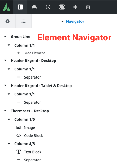
Navigator panel showing page element hierarchy
Library Panel
Section titled “Library Panel”- Contains saved templates and elements
- Includes Avada pre-built content
- Allows saving custom elements for reuse
- Note: Beginners typically won’t need to use this panel
Element Settings Panel
Section titled “Element Settings Panel”When you select any element on the page, the settings panel appears on the right side. It has three main tabs:
Content Tab
Section titled “Content Tab”- Controls the content of the element
- Options vary depending on element type
- For text elements: content, links, formatting
- For images: source, alt text, captions
Design Tab
Section titled “Design Tab”- Controls the appearance of the element
- Includes styling options like colors, sizes, spacing
- More advanced and typically not needed for basic content editing
Extras (Advanced) Tab
Section titled “Extras (Advanced) Tab”- Contains technical settings
- Includes CSS classes, IDs, animations
- Note: Beginners should avoid this tab
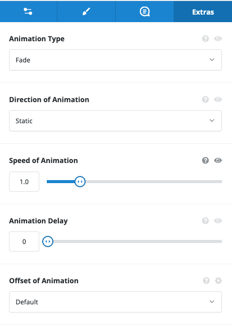
Element settings panel with Content, Design, and Advanced tabs
Inline Text Editing
Section titled “Inline Text Editing”For text elements, you can edit directly on the page:
- Click once to select the text element (blue outline appears)
- Click again or double-click to enter edit mode
- Type to modify the text content
- Use the floating toolbar that appears for formatting options

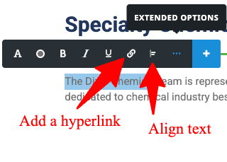
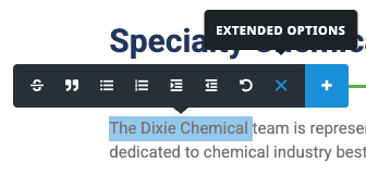
Inline text editing with formatting toolbar
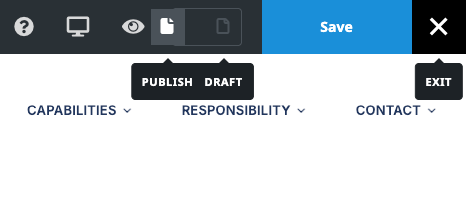
Saving and Publishing
Section titled “Saving and Publishing”When you’re ready to save your changes:
- Click the “Save” button in the top toolbar
- Choose from the available options:
- Save Draft: Saves without publishing
- Publish: Makes changes live immediately
Save options dropdown menu
Exiting the Live Builder
Section titled “Exiting the Live Builder”To exit the Live Builder:
- Click the “Exit” button in the top toolbar
- If you have unsaved changes, you’ll be prompted to save or discard them
- You’ll be returned to the WordPress admin Pages screen
Important: Always use the Exit button rather than closing the browser tab or navigating away. This ensures your changes are properly saved or discarded.
Now that you understand the Live Builder interface, you can proceed to the specific guides for Text Editing and Image Management to learn how to make content changes.